In all of my experience using different programs, development suites, apps, applets, widgets, or however the hell else you want to label them I’ve had a lot of run-ins with poorly chosen words. I’ll share some of the principles I’ve learned, so you can use them to create an optimal user experience in whatever you’re making.
1. Use universal, precise standards
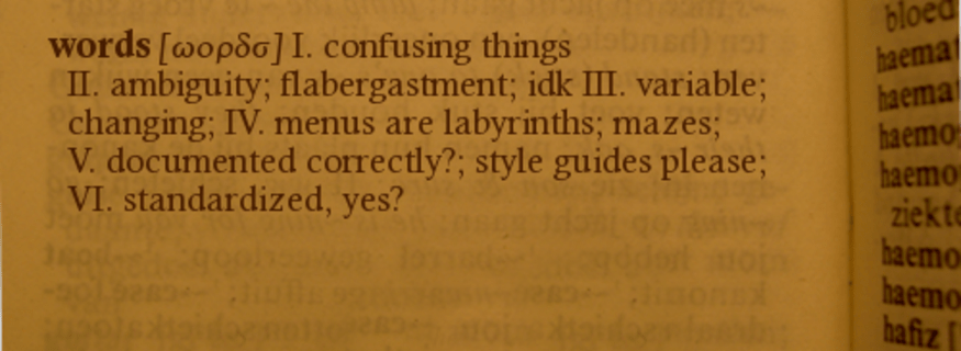
This rule is listed first because it can override all others. Everywhere in life, some words just mean very explicit things, so it’s best to not arbitrarily replace them with other words.
A recent criminal I found breaking this law was in the vector graphics editor Adobe Illustrator. That’s right, even industry-standard tools aren’t innocent. Now here’s the question—what’s the word for that board which painters use for holding colors? A palette. That word is centuries old, and it’s still used today by most image editing programs to pick colors.
Even industry-standard tools aren’t innocent.
But Illustrator, cutting-edge as ever, decided to use a new word—swatch! But—what the hell is a swatch? Dictionary.com says it’s “a sample, patch, or characteristic specimen of anything.” How specific! Learn it or not, this pointless change is confusing. Such changes only distract and burden the user.
That’s not to say that every standard is golden. People used to measure lengths in palms and thumbs, and they labeled diseases as curses. So if you’ve got a reasonably better idea, go for it!
But in most cases, universal standards have stuck around for a reason. The ideas of maths and sciences are the best examples. Don’t say permutation when you mean combination. Don’t say theory when you mean hypothesis. And please, don’t say swatch when you mean palette.
2. Use style guides
Some ideas just don’t have written standards. For example, computer programmers use these things called functions, also known as methods, or procedures, or subroutines, or… oh foobar! Now any experienced programmer will know all those words, but laypeople won’t. So if you’re ever talking or writing to laypeople about these things, be consistent and use only one word, so that you don’t confuse them!
Even in technical documents—be consistent! If you’re in a group of four people writing a report with vector math in it, you don’t want one person saying length, another saying distance, another saying size, and another saying magnitude. Rather, all of you need to agree on a standard beforehand. You need a style guide.
A style guide documents an agreed-upon standard under which the rest of a project is written. Make one and use it!
Style guides also help newcomers to a project’s team get up-to-speed with what’s going on. If a programmer opens a source code and finds a variable named c_te_muzzleFlash::m_flDuration, it’d be nice if there was a style guide to tell them what all those prefixes mean!
3. Don’t forget the why
This one is for documentation writers and teachers. Whenever you’re describing what something is or how it works, don’t forget to include a when or a why. Users need to know the purpose of what you’re describing.
Back to the dreaded swatch example—check out Adobe’s help page on them. You can learn all about what they are and how to use them. BUT no where on the page is it explicitly explained why or when they should be used. What advantages do swatches offer over just picking out colors by hand? (answer: remembering color themes can be useful for long-term projects)
Compare that to Java’s documentation on Lambda functions. Almost a dozen ways of solving a problem are given, and the lambda function is compared against all of these, so that the reader can learn all of the advantages and disadvantages—when they should or shouldn’t be used. Much better!
4. Don’t go technical when simpler words will do

If something is being made for someone else, it shouldn’t be nerdy just because it can be.
Here’s another criminal case. This time, the suspect is my long-term partner-in-crime GIMP, the free image manipulation program. Now, something users like ourselves often want to do is select the visible pixels in an image. What would you think the label for that button is? “Select Visible Pixels”? Ha, nope! Instead, it’s “Alpha to Selection”. I was confused until I learned. Alpha to selection is short for “find pixels on the screen, which have a high alpha (low-transparency), and select them”—in other words, select visible pixels. Of course I understand the jargon now, but if I were to ask anyone on the street what alpha means, even in the context of an image, they would have no idea!
If there are two phrases that mean exactly the same thing, the simpler of the two ought to be chosen. This should have been especially true for GIMP considering many of its users are less-experienced newcomers.
5. Don’t be ambiguous
This rule balances with #4. I’m talking about words that are so simple that the true meaning or purpose is ambiguous. Do you want to know what Adobe Photoshop uses to label its “Select Visible Pixels” button? It just uses “Select Pixels”. Select which pixels? Doesn’t Adobe know how ambiguous that is? The entire image is made up of pixels!
6. Use pictures (or video!)
Have you ever been using a complex development application, and you can’t figure out how to do a simple task? I know I have. So we look up some tutorial or documentation on the official website, and what do we get? They say “find the XYZ tool by finding this entry in the ABC list under this DCE menu and right-clicking on it to find the tool under this other FGH sub-menu and…” yeesh! How can I find all of these menus when there are already half a dozen menus on every inch of the screen?

There’s the saying that a picture is worth a thousand words. It’s cliché but true!
And a video has thousands of pictures.

Leave a comment